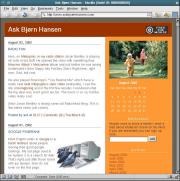
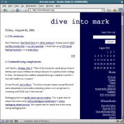
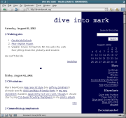
Mark talks about using good fonts for unix. However, judged from my Linux box using Mozilla, his site looked much nicer before he changed the font. It was easier to read anyway.
Screenshots of how this site and his site with the new fonts below. Click for full size.


In other news then I've been playing with a neato weblog related site the last few days... Did you know that diveintomark is one of the most popular weblogs around? From the weblogs that has been active in the last few days, movabletype seems to be the most popular weblog tool. More information later.
Update: Mark left a comment that he changed it a bit; and it looks much better now! (In my browser anyway).


That's weird, it looks *much* better than that on my Linux box. Debian 3.0/Enlightenment/Mozilla/nothing else. Wonder which font it's actually using on your machine.
OK, I updated my CSS. Sadly, I had to reboot my Debian machine back into Windows for browser compatibility testing of an unrelated project. Can you tell me if it looks any better?
Looks much better! I'll make a new screenshot so you can see.
Kickass. Thanks for your help.