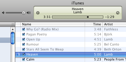
Apple released a new version of iTunes today. I downloaded it to get the "organize playlists in folders" feature. Sadly they've also made it have a "new streamlined look". Yikes. It looks awful (link to full screenshot). Or so I think today. It's likely it'll just be like how new car models often look bad at first. Many more comments (via "Brent Simmons:http://inessential.com/?comments=1&postid=3167)
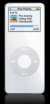
 They also released the iPod nano which looks just beautiful. But so fragile! I'd be worried to put it in my pocket.
I was hoping for a new mini with higher capacity. Darn. Apparently most people only have relatively few songs on their MP3 players.
It seems like they are at least considering phasing the iPod mini out. It's not listed on the main iPod page. If you go to the old url it forwards you to an otherwise hidden Apple Store page where you still can order it.
The iTunes Phone looks pretty dumb. (The TV sports are neat though). It's an old Motorola phone with a tiny tiny music capacity. Not so interesting. (And I don't think Apple are excited about it either, releasing the much cooler Nano at the same time).

BTW, there's rumours going around that the iTunes Phone's 100-song limit is there for DRM reasons, not due to a real technical limitation...
The new iTunes looks okay, but irks me because it’s another new GUI theme from Apple. Both the faux-metal as well as the various cutesy new widget renderings are inconsistent with anything else. Okay, I suppose a step away from the butt-ugly metal theme can only be good news, but a glassy list item highlight with a shadow underneath? WTF? (And has the HIG been updated to give an guidance on when to use this theme?)
I suppose we should forget the ingrained expectations that Apple produce consistent GUIs.
FWIW, the new car design that became fashionable around 2000 (with the bloated body and fractured headlight shape) still looks as attractive as a bucket of vomit to me.
Okay, I’ll crawl back into my cave now.
According to Ars Technica, the iPod nano is not as fragile as it seems.
Don't worry about the iPod Nano, it seems to hold to quite a bit:
http://arstechnica.com/reviews/hardware/nano.ars/3
--
Regards,
Cyril
Ask,
Kevin has the Ipod Nano and loves it. Plenty of room for the normal users (Gym rats).
Kelly
Thanks for URL, Cyril!!!! I looked for it so many time. And here it is =)
I like the design of the new iTunes! It's more compact, sleek, and it feels somewhat faster. I think the biggest improvement design-wise was the "LCD display".. But who knows, maybe this is the direction Apple is heading with their GUI, more compact and sleek?
So, I can stick a CD into my PC and get it on my iPod with iTunes but I can't do that with my DVD's? What's up with that? I don't understand.
Hey Ask, langtid siden! Kigger lige engang imellem indtil din side.. Håber alt går godt i USA!
Er igang med svendeprøven til noget IT supporter uddannelse (boooring;), og vi skal sætte noget linux halløj op, derfor kom jeg lige itanke om dig igen!
Vi ses!